Font pairing feels like a dark art, but it really isn’t. Once you understand a few basic principles about contrast, hierarchy and mood, you can combine typefaces with confidence, even if you’ve never opened a design tool in your life. In this guide, we break down how to pair fonts using 7 rules that actually work, illustrated with the kind of choices you see in real brand projects every day.
Why Font Pairing Matters More Than You Think
Typography carries about 90% of the personality of a design. The wrong pairing makes a premium brand look cheap, or turns a fun product into something that feels corporate and cold. The right pairing does the opposite: it creates hierarchy, guides the eye, and communicates mood before the reader has even processed a word.
Most non-designers get stuck because they either pick two fonts that look almost identical (boring) or two that fight each other (chaotic). The 7 rules below fix that.

The 7 Rules for Pairing Fonts Like a Pro
Rule 1: Stick to Two Fonts, Three at Most
The single biggest mistake beginners make is using too many typefaces. A clean design almost always uses:
- One font for headlines
- One font for body text
- Optionally, one accent font for buttons, quotes or small labels
Think of Airbnb (Cereal for everything), Stripe (Sohne + system fonts), or Notion (Inter + serif accents). Restraint wins.
Rule 2: Contrast Is Your Best Friend
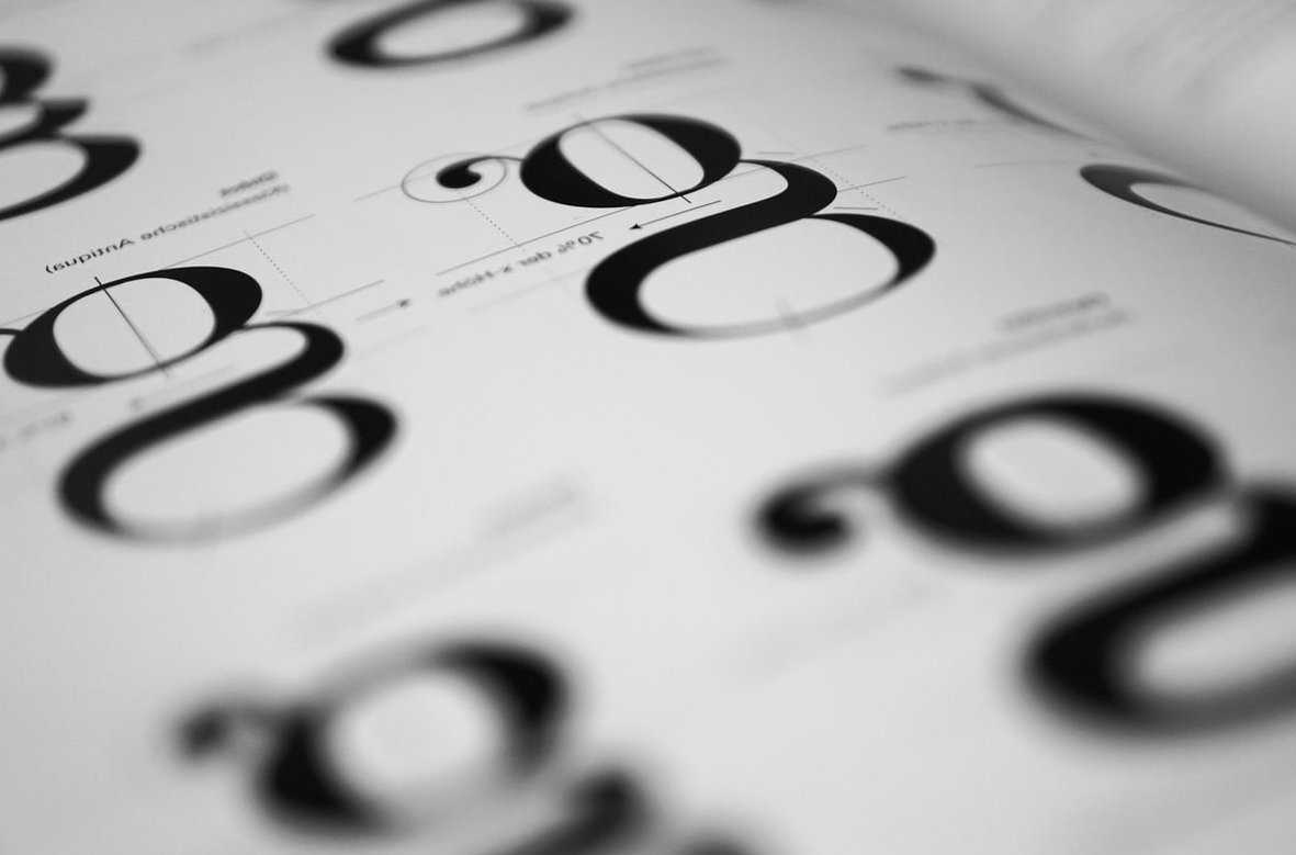
Two fonts should feel clearly different, not vaguely similar. The classic recipe is pairing a serif with a sans-serif because their shapes contrast naturally.
| Headline Font | Body Font | Mood |
|---|---|---|
| Playfair Display (serif) | Source Sans Pro (sans) | Editorial, elegant |
| Montserrat (sans) | Merriweather (serif) | Modern magazine |
| DM Serif Display | Inter | Startup with taste |
| Bebas Neue (condensed sans) | Lora (serif) | Bold and warm |
| Space Grotesk | IBM Plex Serif | Tech, but human |
Rule 3: Match the Mood, Not Just the Shape
Every typeface has a personality. A geometric sans like Futura feels rational and futuristic. A humanist serif like Garamond feels literary and warm. Before pairing anything, ask: what should this project feel like?
- Luxury brand: High-contrast serif + minimal sans (think Didot + Neue Haas Grotesk)
- Playful DTC product: Rounded display + friendly sans (Fraunces + Nunito)
- SaaS or fintech: Neutral grotesque + geometric sans (Inter + Manrope)
- Editorial blog: Modern serif + clean sans (Tiempos + Söhne)
Rule 4: Create Clear Hierarchy With Weight and Size
Pairing isn’t only about the fonts themselves, it’s about how you use them. A single font family can look like a professional pairing if you use different weights and sizes cleverly.
- Headline: 48px, Bold or Black
- Subhead: 24px, Medium
- Body: 16px, Regular
- Caption: 12px, Regular, uppercase, letter-spaced
This is the trick behind minimal brands like Apple or Linear. They rarely use two families, they use one family with strong hierarchy.
Rule 5: The Superfamily Shortcut
If you’re unsure, use a superfamily: a typeface designed with both serif and sans versions that are made to work together.
- IBM Plex Sans + IBM Plex Serif + IBM Plex Mono
- Source Sans + Source Serif + Source Code
- Roboto + Roboto Slab + Roboto Mono
- PT Sans + PT Serif
You literally cannot go wrong. They’re designed to share proportions, x-height and rhythm.
Rule 6: Avoid These Common Pairing Traps
- Two serifs that look almost identical (Georgia + Times = why?)
- Two display fonts fighting for attention
- Script + script (never)
- Comic Sans + anything
- Fonts from wildly different historical periods without a clear intent
Rule 7: Test It in Context, Not in Isolation
A pairing that looks amazing on a font-pairing website can fall apart on a real landing page or business card. Always test your combination:
- In your actual layout, at real sizes
- With real content, not lorem ipsum
- On both mobile and desktop
- In both light and dark mode if relevant
5 Font Pairings You Can Steal Right Now (2026 Edition)
All of these are free on Google Fonts and battle-tested on real client projects:
| Pairing | Best For | Vibe |
|---|---|---|
| Fraunces + Inter | Modern startups | Warm, confident |
| Playfair Display + Lato | Wedding, lifestyle, editorial | Classic elegance |
| Space Grotesk + Space Mono | Tech, developer tools | Nerdy but stylish |
| Archivo Black + Libre Franklin | Bold marketing sites | Loud and clear |
| Cormorant Garamond + Proxima Nova | Luxury, hospitality | Refined, premium |
The Simple Decision Framework
When in doubt, ask yourself these four questions in order:
- What mood am I creating? (luxurious, playful, technical, editorial)
- What’s my headline font? Pick the one that carries the mood.
- What contrasts well but doesn’t fight it? Usually the opposite category (serif vs sans).
- Does it read well at body size? If not, swap the body font.
That’s it. That’s the entire process professional designers use, minus the years of building intuition.
Tools to Speed Up Font Pairing
- Fontpair.co for curated Google Fonts combinations
- Fontjoy uses AI to suggest complementary pairs
- Monotype’s Font Pairing Generator for premium pairings
- Figma and Canva both have solid pairing suggestions built in
Use these as inspiration, not as final answers. The best pairing is always the one that fits your specific project.
FAQ: Font Pairing
How many fonts should I use in one design?
Two is the sweet spot. Three is acceptable if one is used sparingly for accents. More than three almost always looks amateur.
Can I pair two sans-serif fonts?
Yes, but they need clear contrast in weight, width or personality. Pairing a condensed display sans (like Bebas Neue) with a neutral grotesque (like Inter) works beautifully. Pairing Helvetica with Arial does not.
What’s the safest font pairing for beginners?
Playfair Display for headlines with Lato or Source Sans Pro for body text. It’s timeless, free, and hard to mess up.
Should the headline font always be bigger than the body font?
Almost always, yes. Hierarchy relies on size, weight and color contrast. A good starting ratio is 2x to 3x between your headline and body sizes.
Are serif fonts still modern in 2026?
Absolutely. Serifs have made a huge comeback in tech and startup branding over the last few years. Brands like Medium, Vercel and countless DTC companies use serif headlines to feel premium and human.
Where can I find free fonts that pair well?
Google Fonts is still the best free resource. Nearly every pairing recommended in this article is available there for commercial use.
Bottom line: pairing fonts isn’t about talent, it’s about following a few rules and testing in context. Start with contrast, respect hierarchy, match the mood, and limit yourself to two families. Do that and your designs will already look better than 80% of what’s out there.